Data Visualization: designing clear and effective dashboards
Nova Silva creates and delivers data visualization training grounded in a six-module EDF-certified curriculum. Participants learn to design effective visuals, understand human perception, select the right chart types, and tell compelling data stories — with dedicated practical application in Power BI.
Six modules — from perception to workflow
The program is structured into six modules that build from the science of visual perception through chart selection, design, storytelling, and daily workflow. Each module contributes to the EDF certification exam.
Power BI application: Nova Silva creates and delivers Power BI training alongside this certified program. Practical exercises and examples are applied directly in Power BI — connecting design principles to the tool participants use daily.
Introduction
Why we visualize data, the role of the human visual system, and essential quantitative thinking — correlation vs. causation, the power of context, and how to summarize data meaningfully.

Human perception
Pre-attentive attributes, visual memory, Gestalt principles, and fast vs. slow thinking — understanding how the human brain processes visual information to build visualizations people actually understand.

Visualizing data
Table or chart? Start with WHY. The CHRTTS model for selecting chart types: Categorical, Hierarchical, Relational, Temporal, Tabular, and Spatial — matching chart to data and purpose.
Data viz design
Detailed design decisions for each chart type — bar charts, pie charts, scatter plots, line charts, and more. Color use, management dashboard design, visual hierarchy, and common mistakes to avoid.

Storytelling
From exploration to explanation — how to frame a data insight as a narrative. The storytelling arc, data cuts, cameos, and decoration, and how to structure a message that your audience will retain.
Workflow
Implementing effective data visualization in daily practice. The five design sheet method for structured ideation and the style guide for consistent, maintainable reporting across teams.
Published learning material included
Participants receive a copy of the official EDF practitioner's guide — a published book that supports both the training and ongoing reference after the program.
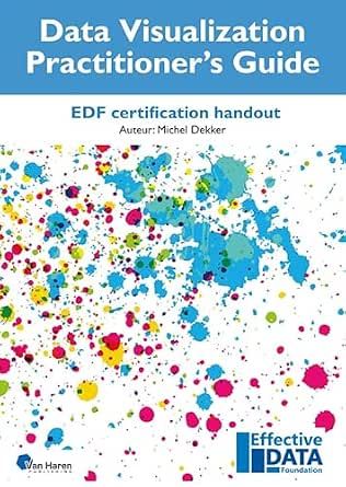
Data Visualization Practitioner's Guide
Written by Michel Dekker and published by Van Haren Publishing, this guide covers all six modules in full — from quantitative thinking and human perception through chart design, color, storytelling, and workflow. It is both the course companion during training and a lasting reference for daily reporting work.
Author: Michel Dekker · Published by Van Haren Publishing · First edition, February 2024 · ISBN 978 94 018 1131 6
View on AmazonWhat participants will be able to do
Participants leave with skills they can put into practice immediately — and an EDF certification that validates them
Apply knowledge of human visual perception to design visualizations the brain processes faster and more accurately
Use the CHRTTS model to consistently select the right chart type for each data scenario
Design management dashboards with correct visual hierarchy and effective use of color
Apply Power BI best practices — layout, formatting, filters, slicers, and report navigation
Tell compelling data stories — from exploration to explanation — using the storytelling arc
Earn the EDF Data Visualization certification and establish a consistent style guide for the team
Who this training is designed for

Analysts and report developers
Professionals who build and maintain Power BI reports and want to improve their design quality and consistency.

BI and analytics teams
Teams responsible for the quality and consistency of dashboards across departments or the whole organization.

Business users with reporting responsibilities
Non-specialist users who create or adapt Power BI reports and need a stronger design foundation.

Organizations standardizing their BI environment
Companies aiming to establish consistent reporting standards and raise overall dashboard quality across teams.
Flexible delivery options
Designed to fit your organization's schedule, team size, and reporting context.

In-company training
Delivered on site or online for teams within your organization, using examples and exercises drawn from your own reporting environment where possible.

Online in-person training
Interactive sessions delivered remotely with live instruction, practical exercises using Power BI, and real-time feedback and discussion.

Tailored programs
Customized programs aligned with your specific Power BI setup, reporting standards, or organizational maturity — including integration with existing report templates and style guides.
Ready to improve reporting quality in your organization?
We are happy to explore how this program can be tailored to your team's Power BI environment, reporting standards, and learning objectives.